Minimal Jewel Tone Wedding Invitations: Joan & Brad

I grew up with Brad in Northern Virginia, and while we weren’t close in our youth, he grew into one of my favorite people. Brad has been there for me in some rough times and has never shied away when trouble comes. For that I am forever grateful.
He reached out about doing his wedding invitations and I was elated. I was hoping to letterpress them, but with my summer travels, that was not in the cards. Instead I opted for a digital design that they could easily order themselves.
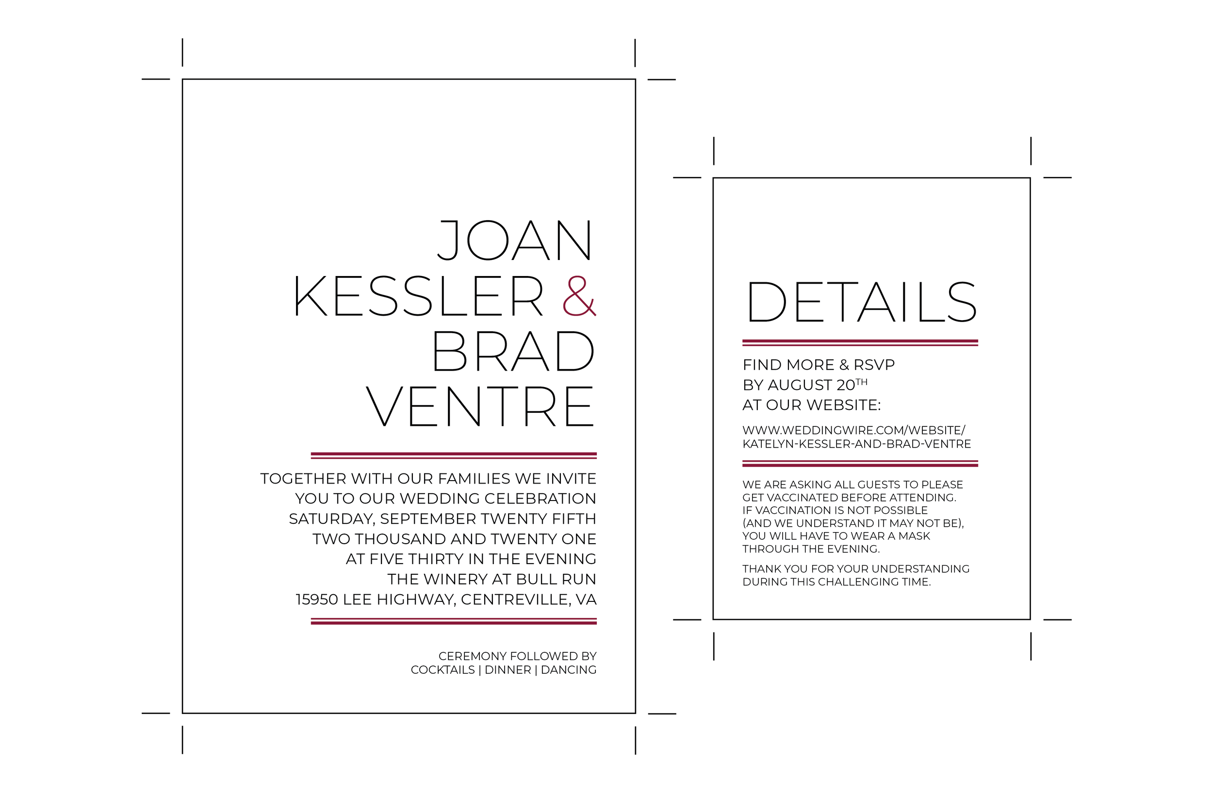
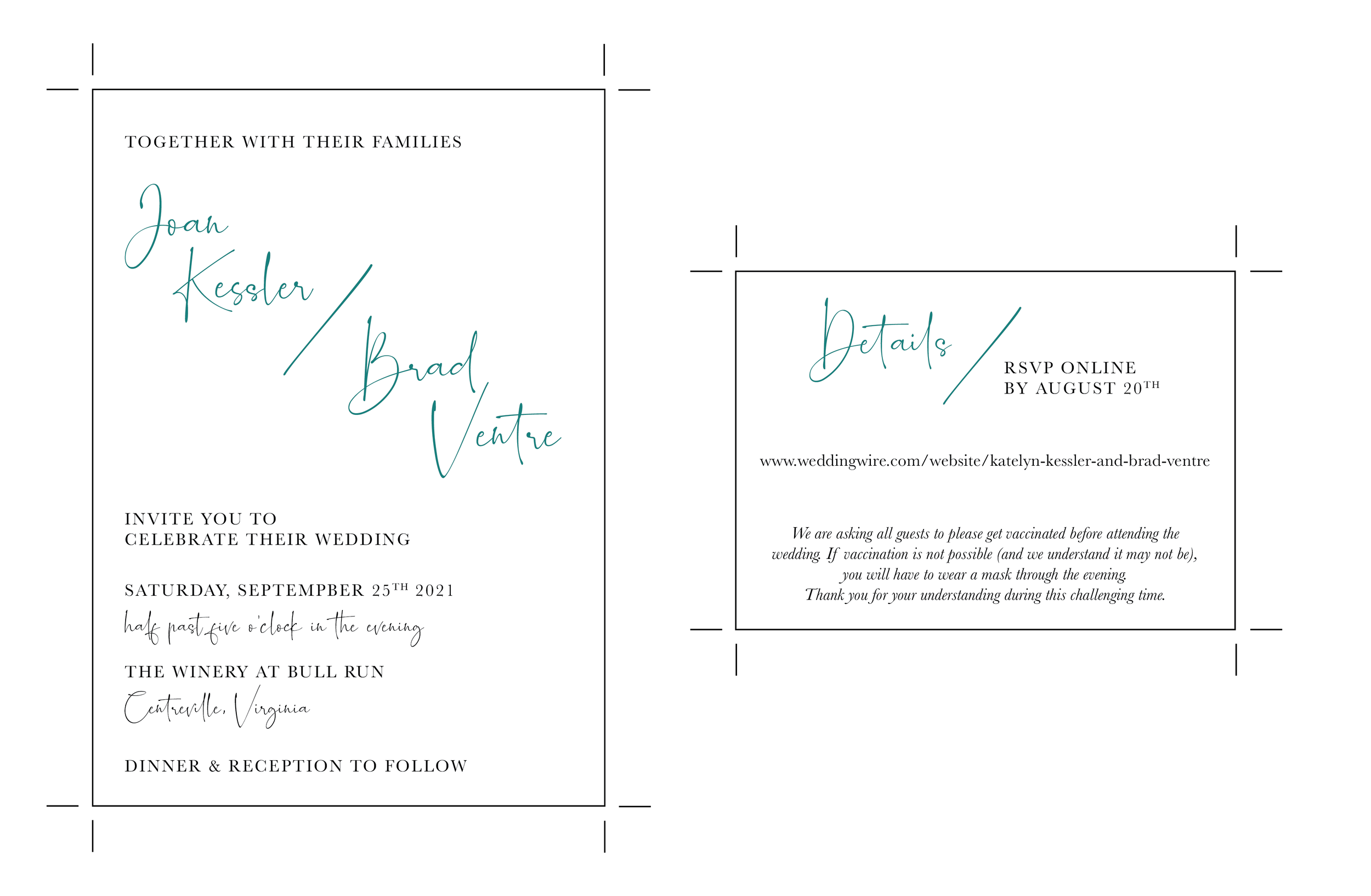
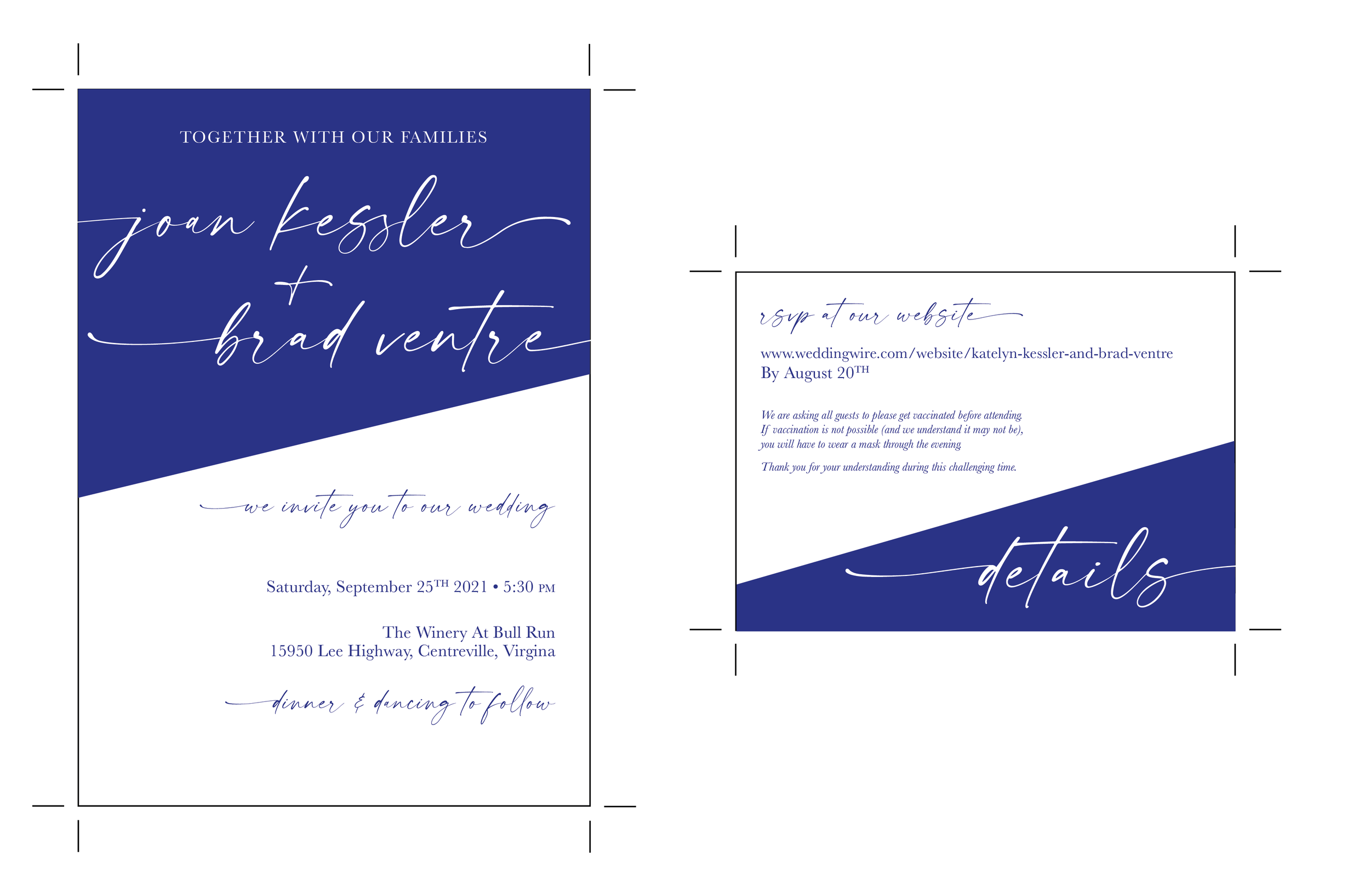
They didn’t have any clear “themes” for the day or a strong pull in a design direction when I did the initial consultation. We decided that they would be clean, type focused and minimal. I mocked up a few versions and sent them over before we decided on the color split. They were using a variety of jewel tones for the wedding day, so I worked through those options before they decided on blue.

The final result was simple and elegant. I couldn’t be happier with them and was so thankful to receive my own design in the mail for their wedding day. Cheers to Joan & Brad!