Illustration: Navy Strength Gin Bottle

Every once & awhile, I take on a unique project. When I got the opportunity to work on an illustration for a gin bottle, I jumped at it! I’ve long had a passion for cocktails and mixology. And, I have even done some calligraphy work for Makers Mark, but knew working on a bottle would be something truly special.

James Bay Distillers is currently based in Seattle but works in and out of Canada as well. When they approached me about the project, we discussed inspiration and style. They loved some muses that were perched on a rock on a vintage Canadian twenty dollar bank bill. The original gin was going to be called “Pacific Coast Gin” so we discussed using the muses but working them into mermaids or sirens.

The gin was also going to be a light blue color from the botanicals, so I used that to do the final sketch. I first worked up some rough mock ups and then we went back and forth on hair length, coral pieces and engraving details. I also tried to make sure the style fit in with their existing illustrations.
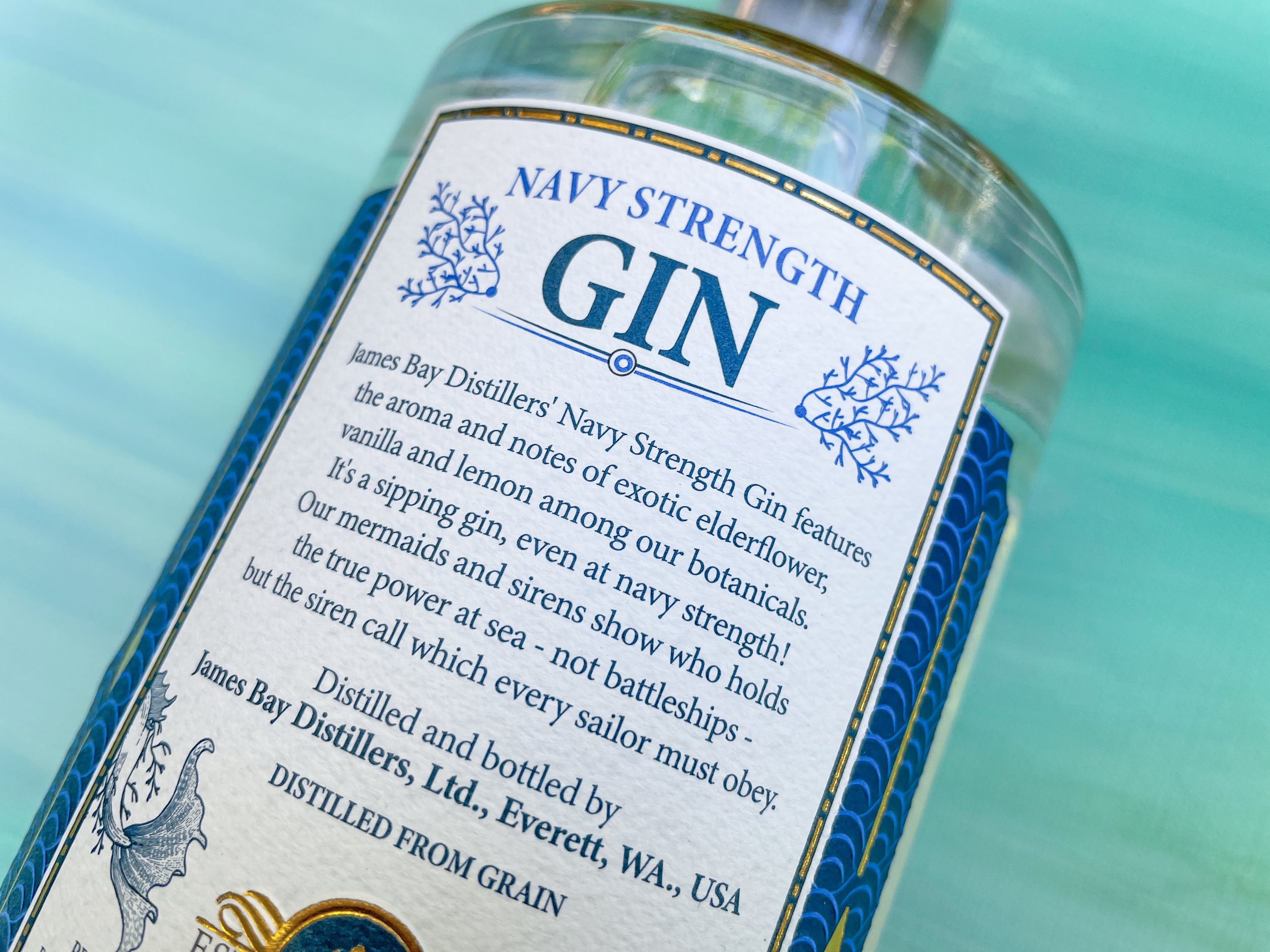
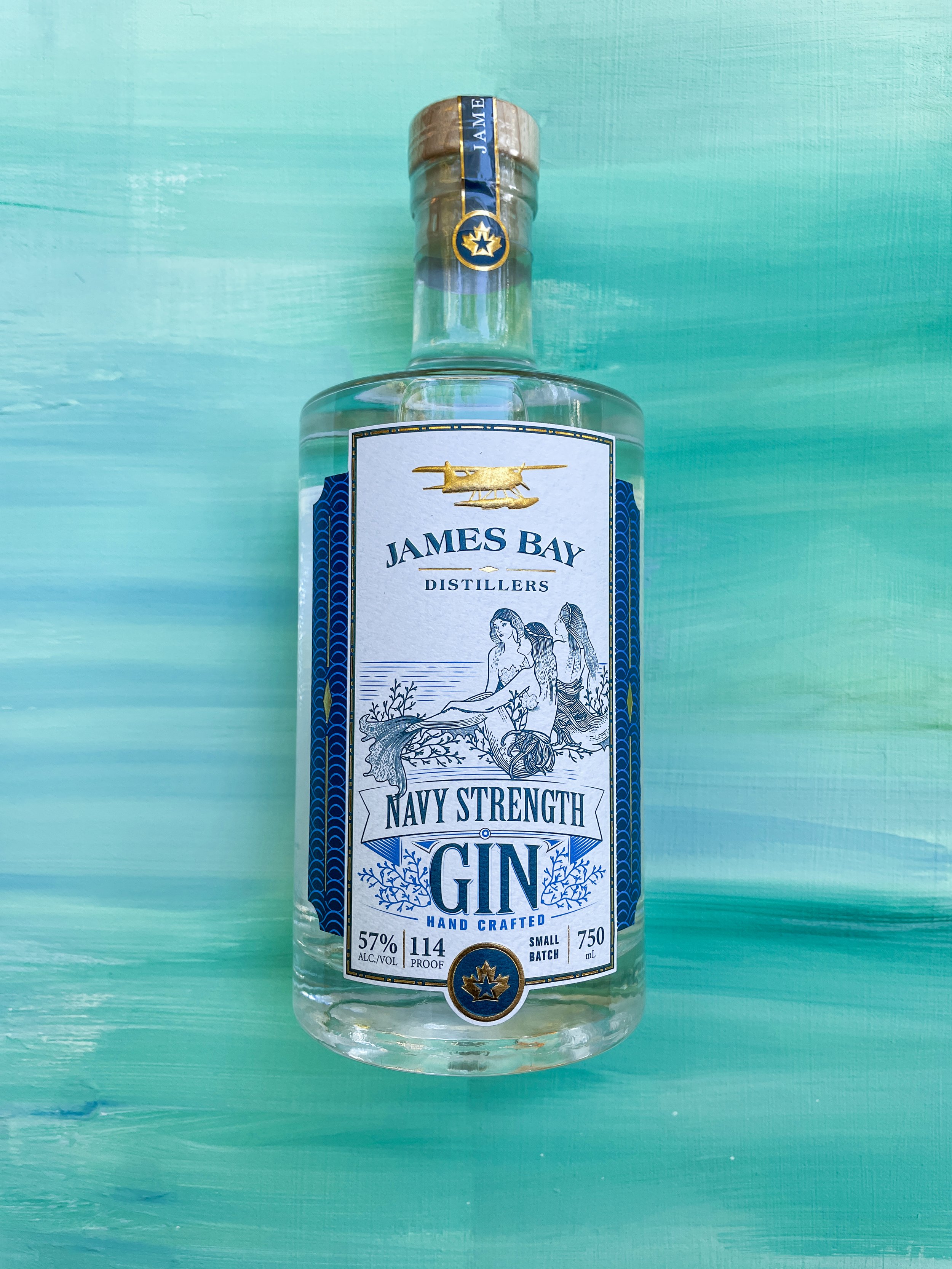
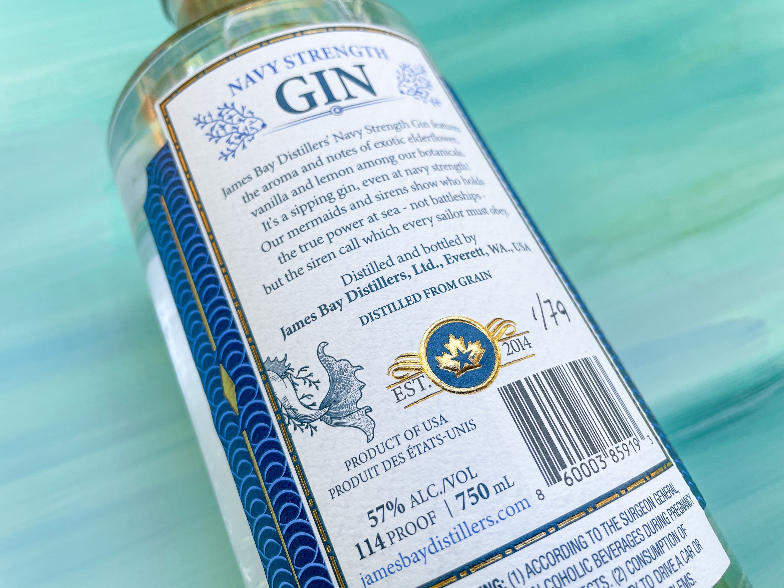
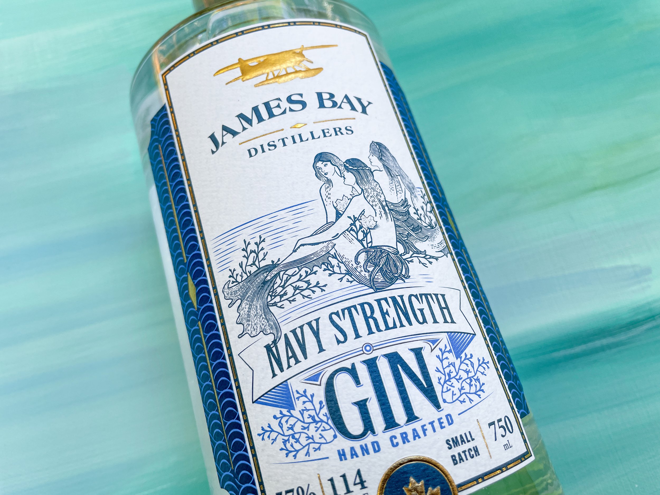
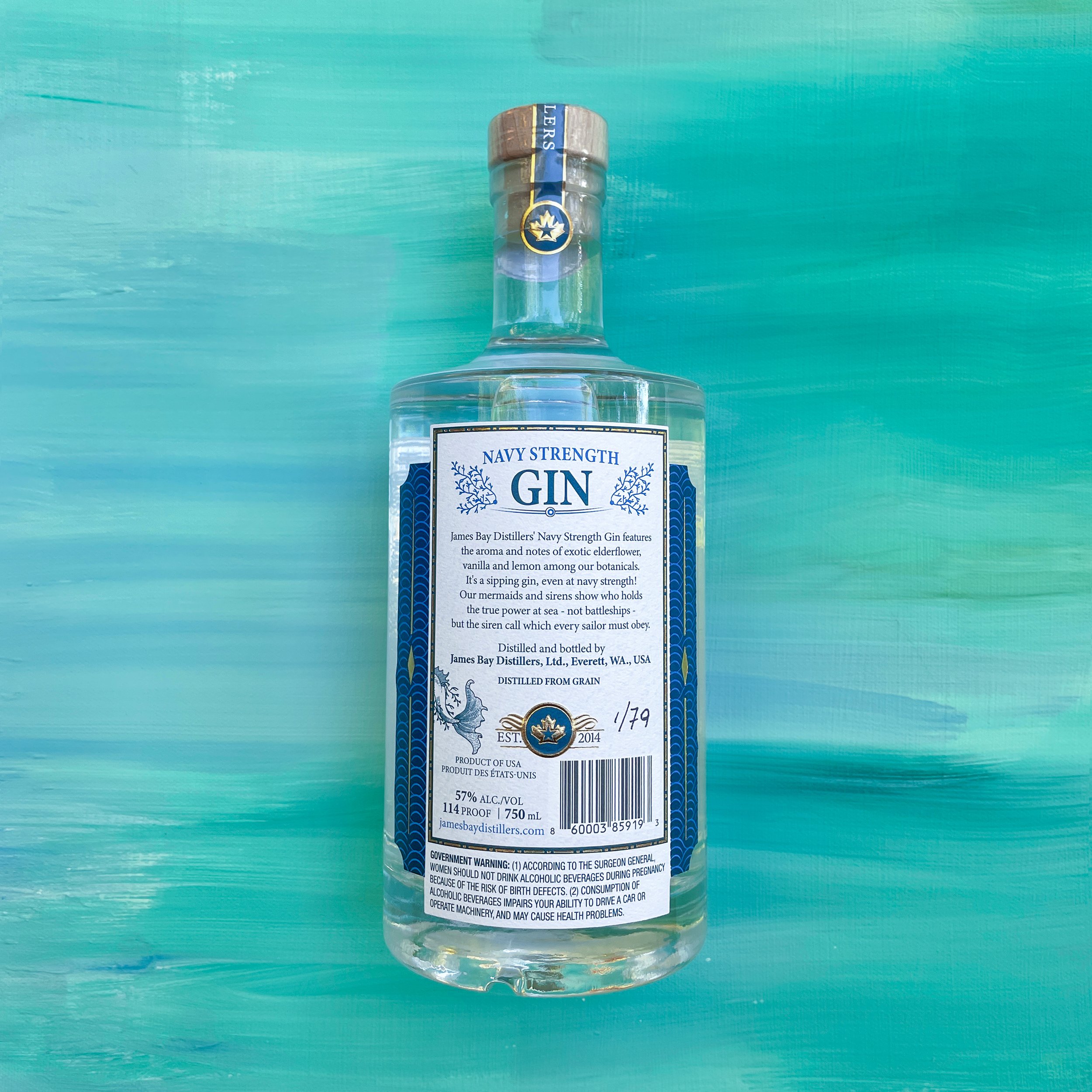
Once I finished the illustration, they sent it off to work with their label maker. They tweaked the scaling so the fin from one of the siren’s wraps onto the back of the bottle. I love how they reused the coral to surround some of the typography.
I just got my first bottle delivered to me through friends last weekend and I can’t wait to try it. If you are in the Seattle area, go have a taste over at James Bay Distillers. I hope I can work with them again on a future project.